
About this manuscript
Letter pointing
Because the Arabic alphabet has
29 letters with only 19 different letter shapes, and since fifteen of
its letters are distinguished by the placement of dots (‘points’ or iʿjām),
whereas ten of the fourteen un-pointed letters share exactly the same shapes as
pointed letters, it seems that dots are essential to read
Arabic. Modern printed books are fully-pointed, but educated pre-modern
Arabic readers were remarkably deft at reading texts without the aid of
points, and their opinions varied about the extent to which letter
pointing was actually necessary.
Al-Qalqashandī (d. 821/1418), author of a compendious manual on writing, tells that one ninth-century scholar disliked pointing letters, claiming that the addition of dots in a document constituted an insult to the intelligence of its recipient! On the other hand, some urged the marking of dots, saying “Everything has a special radiance, and the radiance of writing is the pointing of its letters.” Al-Qalqashandī seems to have supported the latter camp since he praised the clarity of properly-pointed writing and adduced in support a cautionary tale about a letter a Caliph once wrote to a regional administrator to enumerate the population of his district. The verb ‘to enumerate’, aḥsā (أحصى) differs only in one dot from the verb akhṣā ‘to castrate’ (أخصى), and a dot inadvertently appeared over the ح in the Caliph’s letter, enabling its reading as a خ, whereupon the administrator began castrating his subjects, resulting – as the story goes – in more than a few deaths! (al-Qalqashandī, Ṣubḥ al-aʿshā. Cairo: al-Amīriyya, 1914, vol. 3 pp. 153-154)
Despite the warnings of dire consequences, writers of medieval manuscripts nonetheless added points rather arbitrarily. High-quality manuscripts can be very careful in correctly pointing letters throughout, but most manuscripts omit various dots, and more informal copies of books, or personal notes can be very deficient in points. The example below, an excerpt from the biographical dictionary al-Muqaffā by the Egyptian historian al-Maqrīzī (d. 845/1442) is written in its author’s own hand, and the considerable lack of pointed letters (especially for common words) is indicative of the ease by which a scholar could read substantially-unpointed texts.
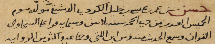
Fully-pointed, the text reads:
حسن بن عمر بن عيسى بن خليل الكردي الدمشقي مولده يوم الخميس العشرين من ذي الحجة سنة ثلاثين وستمائة قرأ على السخاوي القرآن وسمع الحديث منه ومن ابن اللتي وجماعة وأكثر من الرواية
Manuscript writers also did develop a system that would have avoided misinterpreting ‘census’ as a ‘mass-castration’ by a device known as ihmāl ('leave-out'): a sign inserted above or below un-pointed letters to indicate that a reader should not mentally add a point. Overall, ihmāl marks are uncommon – a testament to the ability of readers to correctly infer un-pointed letters – but ihmāl marks do appear in a small number of contexts. Difficult and uncommon words sometimes bear a mark to ensure correct reading (especially in manuscripts of poetry collections); ihmāl marks also had an evident aesthetic function, as texts written in more ornate calligraphic hands sometimes mark ihmāl in words which no reader ever would reasonably mistake; and the marks can be more common in manuscripts from parts of the world where Arabic was not the first language.
As examples of ihmāl marks, copyists would write a small ح under the letter ح to indicate that should be read without dots, and the same method applied to the letter ع, so as not to confuse it with a غ. To ensure that the letter س would not be read as the pointed letter ش, some copyists inserted a short dash above.
Taṣḥīf
Because most manuscripts were not fully-pointed, subsequent copyists faced difficulties when reproducing books: they had to guess the correct reading of un-pointed letters, and decide whether or not to mark points in their copies. Occasionally copyists made mistakes, adding superfluous dots where they did not belong and corrupting the text in the process. These mistakes are known as taṣḥīf, and are common in the hastily-made books written by professional copyists who did not necessarily understand all the words they were writing. Taṣḥīf-style mistakes are particularly frequent in the writing of unfamiliar names and places, and in copying poetry, since most copyists lacked the specialist education to make sense of the more complex verses.
Vocalisation
Modern Arabic printing and pre-modern Arabic manuscripts are alike in their approach to marking short vowels: except in the case of Qur’ans, specialised collections of poetry and some carefully-produced books, most Arabic manuscripts contain sparse vocalisation. Studious copyists did fully vocalise difficult words, and added some vowels in potentially confusing passages, but then as now, Arabic readers could fluently read largely-unvocalised texts.
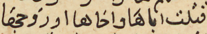
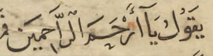
Like most professional copyists, the writer of Leiden Or. 705 marked very few short vowels, and even though the Sarḥ al-ʿuyūn contains long tracts of poetry, our copyist was no specialist, and he eschewed hazarding guesses as to poetry’s vocalisation. Intriguingly, the copyist did add some short vowels, but usually only in places where any reader could have guessed the correct vowel – such as the short ‘a’ fatḥa before a long ‘a’ alif. See an example on p. 53 illustrated above where two short vowels are marked in the sentence where a warrior claims: “I killed either her father, brother or husband.” قتلت أباهَا وأخاها وزوجهَا.
The marking of ‘obvious’ short vowels in contrast to copyists’ regular omission of vowels in more difficult cases where they would actually help readers is a relatively common feature. Perhaps copyists added ‘easy’ vowels where they could be sure of being correct, and with this smattering of short vowels, they made their copies look more studious!
Final Yāʾ
In modern printed Arabic (outside of Egypt), the final yāʾ is written with two subscript dots to distinguish it from the same-shaped alif maqṣūra final long a-vowel. In medieval manuscripts, however, this convention does not obtain: copyists sometimes placed two points under an alif maqṣūra and left the final yāʾ without points, sometimes they placed two points under both letters, and some never pointed either.
The Hamza
A major orthographic difference between modern printed Arabic and pre-modern manuscripts is the handling of the letter hamza. Modern Arabic has detailed rules about hamza notation and the correct vowel-letter for the hamza’s ‘seat’, but manuscript copyists were much less strict. Except in the cases of high-quality poetry collections or very carefully-executed manuscripts (such as Qur’ans), copyists very infrequently wrote the hamza: they usually sufficed just with writing its ‘seat’, or, especially in the case where the hamza is the last letter of the word, they neither wrote the hamza nor its seat at all.
Likewise the alif madda (آ) was infrequently written, and sometimes copyists would use that sign instead to mark an alif bearing a hamza.
More about this manuscript: lessons 14 and 21.
Further reading
Witkam, Jan Just, "The Neglect Neglected. To Point or Not to Point, That is the Question", Journal of Islamic Manuscripts 6 (2015), 376–408
Exercises
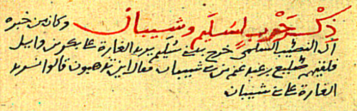
Leiden Or. 705 Sarḥ al-ʿUyūn was prepared by a professional copyist. Its orthography is typical of Arabic manuscript style of the sixteenth to eighteenth centuries in the Ottoman Empire and the copyist pointed most of the text’s letters. Questions 1 and 2 explore his writing approach, and Question 3 and Assignment 1 will reveal how he copied poetry, via a comparison of the manuscript in the frame above with a fully-vocalised version of the same poem typed in accordance with the modern rules of orthography.
Questions
-
Examine page 9 of the manuscript and look at the writing of final yāʾs and alif maqṣūras: what is the copyist’s approach to writing these letters, and is he consistent?
-
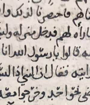
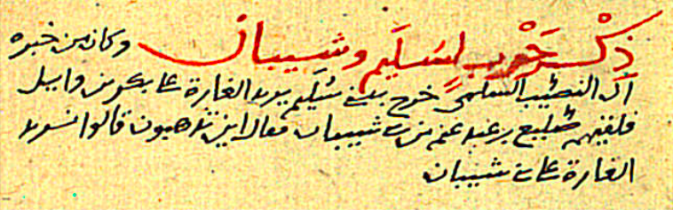
Examine the first two lines in black ink after the large passage in red on p. 159: how deficient is the copyist’s pointing here? Can you discern which letters he omitted to point?
-
Compare the writing of a poem by the pre-Islamic poet Ḥātim al-Ṭāʾī in Leiden Or. 705 on p. 42 in the frame with the fully-vocalised version typed in accordance with the modern rules of orthography (download it from the link in the 'Exercises' section just above). The manuscript copyist made two errors by mis-reading letters: what are the words, and in which lines do they occur?
Assignments
-
Compare the manuscript version of Ḥātim’s poem (Leiden Or. 705 p. 42 in the frame) with the printed version and describe with examples how they differ in (a) writing the hamza, (b) vocalisation, and (c) pointing letters?