About this manuscript
A special Book of supplications
Ibn al-Jazarī tells that he wrote al-Ḥiṣn al-Ḥaṣīn (The Fortified Keep of the Noble Prophet’s Speech) in his madrasa in Damascus in 791/1388, a time when the city was besieged and “the gates are all locked and blocked up with stones, the people cry for help on the walls … the water is cut and the city’s suburbs plundered…” Al-Ḥiṣn al-Ḥaṣīn is an appropriate book for such times: it is a collection of supplications to God.
Muslims distinguish prayer (ṣalāt) from supplication (duʿā): the former is the ritual to be performed five times each day, whereas supplication can be made at any time, and involves the worshiper asking God’s help for specific needs. The Prophet’s own supplications were memorised and thousands recorded in disparate collections of hadith. Al-Ḥiṣn al-Ḥaṣīn gathered and organised these within one volume, and hence the book became popular as a guide for how to make proper and effective supplications.
This lesson’s manuscript is ʿUddat al-Ḥiṣn al-Ḥaṣīn, an abridgement made by Ibn al-Jazarī of his al-Ḥiṣn al-Ḥaṣīn. ʿUddat was just as popular as the original, since its smaller size enabled greater portability. The book's contents, however, remained weighty in the mind: Ibn al-Jazarī refers to the texts of the supplications as the "Believer's arms from the storehouses of the Prophet ... the preserving safeguard drawn from the words of the protected infallible Prophet", and owners of the book would have felt that they were carrying with them very holy words uttered between the Prophet and God. ʿUddat's textual interaction with the Divine carried over into its script’s iconography as the following sections reveal.
Script between books and Qur’ans
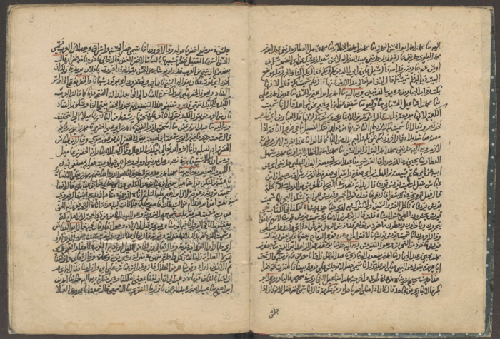
For the substantial majority of Arabic manuscripts, pragmatism and economy were the primary considerations of the copyist. The manuscript was intended to convey its text, and most manuscripts were accordingly written in quickly-rendered naskh script with very few diacritical marks for vowels, and sometimes limited points on the letters too. Most copyists filled a good portion of the page with the text block, which itself was usually crammed full with text. As objects to behold, most manuscripts thus appear as masses of text, page after page.
Manuscripts of the Qu’ran (known as muṣḥaf,
pl. maṣāḥif), however, received radically different treatment. Muslim calligraphers developed manifold approaches to copy muṣḥafs, all with the aim of creating lavish volumes befitting the Word of God. The evolution of the forms of muṣḥaf calligraphy and other aspects of the physical presentation of the Qur’anic text are too numerous to summarise, but ever since the very first muṣḥafs of the Umayyad-era, evident efforts were made to produce texts which were readily distinguishable from all other Arabic manuscripts. From the fifth/tenth century when most book manuscripts were written in naskh script, the majority of Qur’ans were written in rayḥān and muḥaqqaq
scripts, and these scripts were almost never used to copy other books. It was also customary for Muṣḥaf copyists to use different scripts when writing the non-divine words in the muṣḥaf (e.g. chapter titles, verse-markers and supplications).
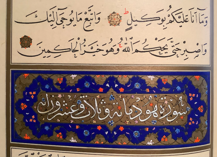
Close consideration of the special calligraphic features reserved for the words of the Qur’an reveal that script was intentionally used to signal the presence of God’s word and distinguish it from terrestrial books.
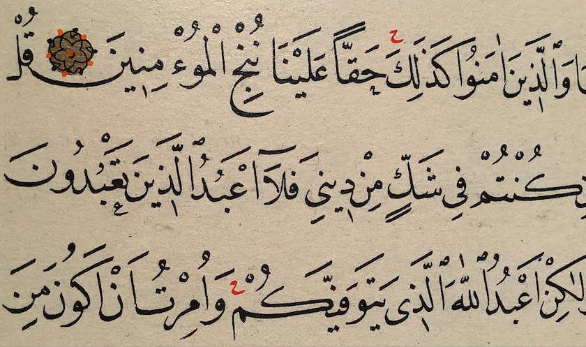
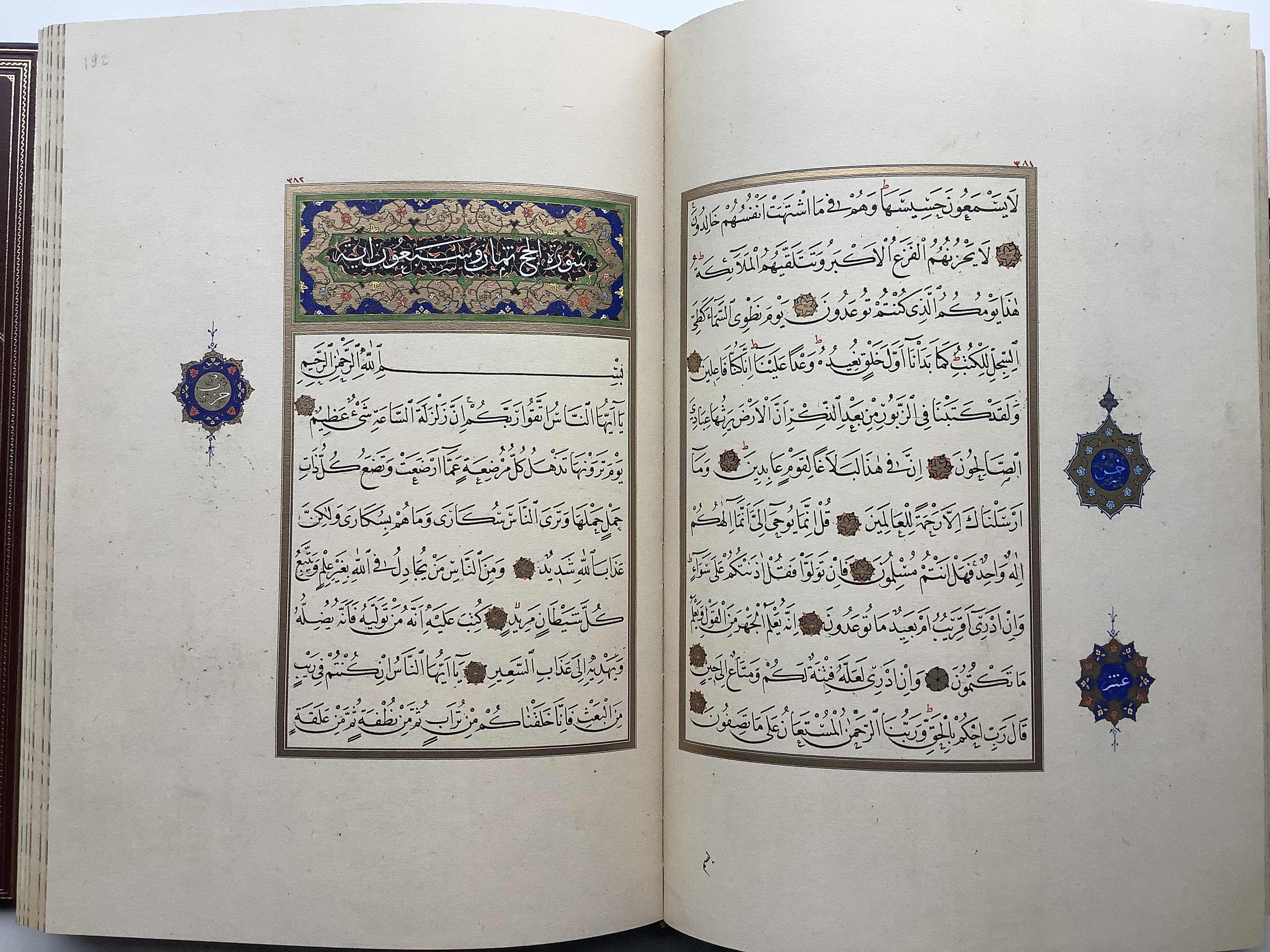
By the early ninth/sixteenth century, Qur’ans began to be written in naskh, but copyists retained various features to separate naskh bookhand from the naskh of the muṣḥaf. For examples, the Ottoman court calligrapher Shaykh Ḥamdullah (d. 1520) makes frequent use of ihmāl (see Lesson 2) to mark words which no reader would realistically mis-pronounce. Such ihmāl marks would only infrequently be written in ‘regular’ books, and certainly never with the exceptional frequency of his muṣḥaf, and hence the nature and effect of their inclusion in this manuscript helps distinguish its calligraphy.

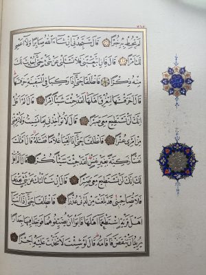
The image below-right of Shaykh Ḥamdullah's Muṣḥaf contains other distinguishing calligraphic aspects:
- In some cases a vertical downward stroke marks the ‘i’-vowel kasras instead of the more regular slash (often, but not always preceding a yā) ;
- Generous spacing between letters, words and lines;
- Exaggerated ‘bowls’ for the final-form nūn and jīm letters;
- Variations on the final mīm letter: sometimes it appears with a long downward stroke (in يتوفيكم), or much truncated and at an angle (in كنتم);
- Occasional serifs added to the tops of alif and lām letters;
- More complex and varied pen-strokes to join letters, such as the yāʾ and kāf in يتوفيكم.

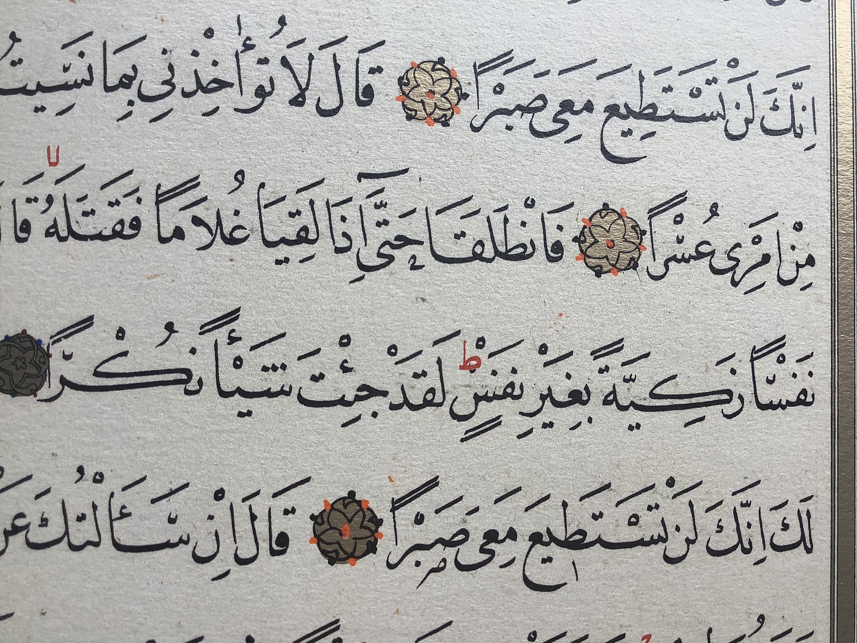
Also unlike copyists of most book manuscripts, the muṣḥaf calligrapher engages what seem to be deliberate variations in writing letters and vowels. In the example below, also from Shaykh Ḥamdullah’s Muṣḥaf, the tanwīn double-lines marking the case-endings of نفسًا, زكيةً, نفسٍ, and شيئًا are exaggeratedly broad, and cluster together in these verses to create a distinct physical image; the variation of vowel-marker lengths throughout the manuscript combines with the variable ratio of letter sizes, and the resultant design seems intended to engender images of movement. Such delicate variation in pen strokes is common in one-page calligraphic examples; Muṣḥafs are special for the application of this principle across an entire text of hundreds of folios. This is another element of script iconography particular to muṣḥafs.
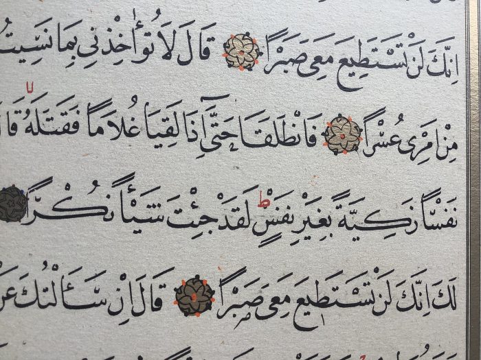
Each of the above features can be found in various naskh manuscripts of regular books, but the consistent application of all these features together across the page and all pages of the muṣḥaf render it visually unique: a script iconography reserved to indicate the presence of the Qur'an.
Other elements of muṣḥaf-writing distinguished from standard bookhands are:
- the embellishment of letters by outlining them in different colour ink, making for a thicker visual impression than the usual quickly-copied naskh of terrestrial books;
- the complete pointing of all letters and vocalising of all vowels throughout, which was only infrequently done for manuscripts other than muṣḥafs.
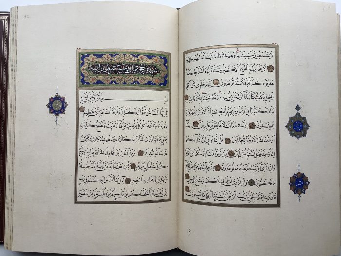
Beyond the calligraphy, the page layouts of the muṣḥaf from the eighth/fifteenth century onwards are embellished and made more lavish via distinguishing features, rarely applied all together for manuscripts of other books:
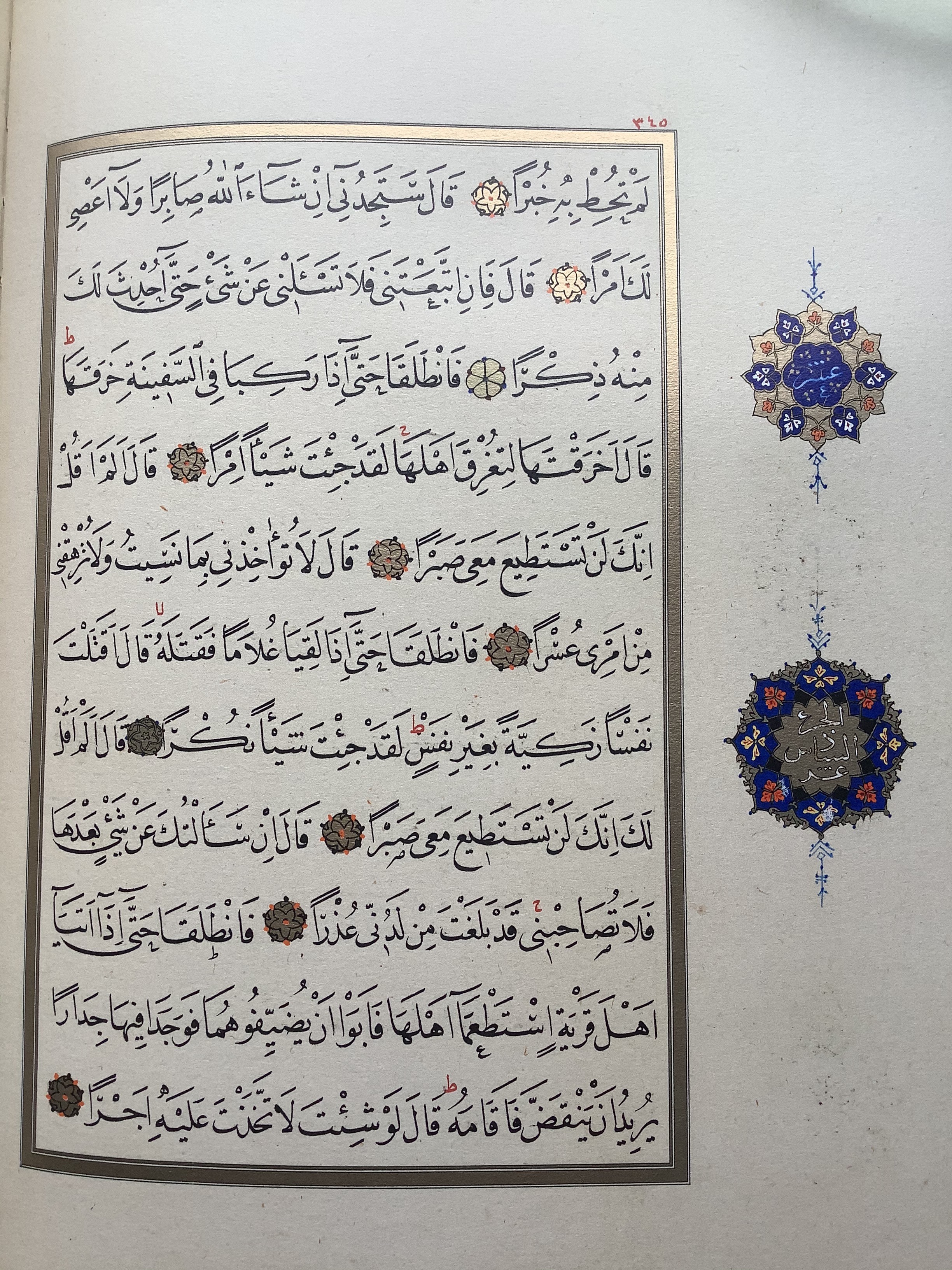
- Jadwal lines: all text blocks are contained within a (often gold-illuminated) frame;
- Margins: muṣḥaf margins are very generous, creating significant white-space on the page;
- Margin offset: muṣḥaf text blocks are aligned closer to the binding-side of the page, and away from the outer edge; this was apparently to protect the Divine text, by placing it further from the outside where pages would be more easily damaged;
- Frontispieces: the first page or folio of a muṣḥaf were usually decorated with full-page geometric designs known as ‘carpet pages’;
- Decoration and illumination: every page of muṣḥaf bears further painted decoration in the forms of coloured and/or illuminated verse markers, chapter headings, and other markers such as roundels, palmettes and vignettes which indicate sections of the Qur’an.
Script iconography and ʿUddat al-ḥiṣn al-ḥaṣīn
Because Ibn al-Jazarī’s collection of supplications contains the words uttered by the Prophet when addressing God, it is noteworthy that many manuscripts of ʿUddat al-ḥiṣn al-ḥaṣīn, such as Leiden Or. 14.076, adopt features that align the calligraphy and presentation of the text closer to the muṣḥaf than to the bulk of the manuscripts of 'regular' books. By the ninth/fifteenth-century date of the Leiden manuscript, the elements of muṣḥaf iconography were well-established, and it is also noteworthy that the Or. 14.076 copyist did not incorporate every aspect of the Muṣḥaf
iconography, suggestive that the copyists understood what iconographic features could be employed to ensure respect for ʿUddat al-ḥiṣn al-ḥaṣīn without going so far as to present it equal to the Qur’an.
In terms of layout, Leiden Or. 14.076 has an elaborate titlepiece (f. 4r). Though similar to a muṣḥaf, it is not laid out exactly the same, as the title is written in the rectangular panel and roundel, whereas a muṣḥaf carpet page is usually devoid of script. A number of other Mamluk-era book manuscripts have titlepieces with similar decoration as Or. 14.076, but the following page (f. 4v) also has a decorated headpiece with the Bismillah (less common with ‘regular’ books); note also how the text is outlined (a rarer feature in non-muṣḥaf manuscripts).
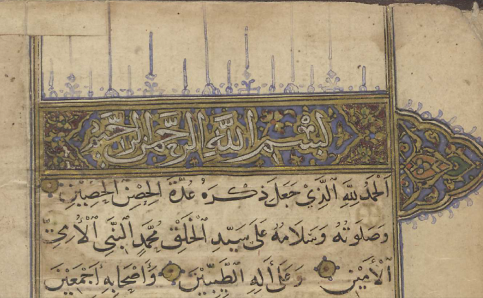
Or 14.076 also contains its entire textblock within illuminated jadwal lines (few ‘regular’ manuscripts have any jadwal lines, and if they do, very few continue beyond the first folio). Each hadith is separated by a roundel, which uncannily resembles the verse-markers of the muṣḥaf.
In terms of calligraphy, Or. 14.076 has outlined text for titles and other headings, it is fully vocalised, fully-pointed, and it contains numerous aesthetic ihmāl marks and downward stroke kasras noted as features of the Shaykh Ḥamdullah muṣḥaf. Many of these features can be found in other well-produced naskh-script manuscripts of ‘regular’ books, but the concentration of them and the consistency of their presentation of Or. 14.076 bring its text very close to the iconography of the muṣḥaf.
Taken as a whole, the nature of the script itself precisely befits a text that readers were expected to hold in a second-tier level of veneration; the Prophet's prayers clearly ranked beneath God's Word in the Qur’an, but equally their symbolic value was greater than of any other Arabic text.
Script iconography
Despite the great energies devoted to developing calligraphy and embellishing texts like the muṣḥaf, there are very few pre-modern books written about the conventions and creative thoughts of calligraphers. Only by treating script as an art form with its particular iconographies, and by critically comparing the vast output of manuscripts can we begin to think about the extra-textual meanings which copyists could engage when producing books. There are certain trends visible in the development of the muṣḥaf, and many elements of muṣḥaf-writing were transferred into other books. The fact that these crossovers often concern books of high cultural status (such as hadith collections, or famous mystical poetry collections of al-Rumi's Masnavi or Hafez's Dīvān), indicates that the presentation of script and book layout was actively employed to represent the veneration of a text. Texts had iconographies that await exploration.
Further Reading
Blair, Shelia, Islamic Calligraphy. Edinburgh: Edinburgh University Press, 2006.
Farhad, Massumeh and Simon Rettig (Eds),The Art of the Qur'an: Treasures from the Museum of Turkish and Islamic Arts. Washington: Smithsonian, 2016.
See descriptions of the relevant manuscript terminology in A. Gacek, Arabic Manuscripts - Frontispiece, Headpiece, Palmette, Qur'an, Qur'anic Scripts, Roundel, Rule borders, Titlepiece, Vignette.
Assignments
-
Compare the calligraphy and text-layout of Leiden Or. 14.076 with the examples from the Shaykh Ḥamdullah Muṣḥaf illustrated above. List at least 5 specific examples from different pages in the Leiden manuscript which resemble the iconography of the Muṣḥaf. Also identify at least 5 specific examples where the Leiden manuscript exhibits differences to the physical representation of text in the Muṣḥaf.
-
To consider the extent to which the copyist of Leiden Or. 14.076 endeavoured to differentiate his text from the practice of copying 'regular' books of scholars, compare the Leiden manuscript in the frame with other manuscripts copied around the same time: Leiden Or. 640 (Jāwidan-i Khirad, a book of non-Prophetic wisdom sayings), Leiden Or. 1037 (a text of jurisprudence) and Leiden Or. 424 (a history of Mecca). Discuss the extent to which you consider these three manuscripts share common similarities in the way they represent the Arabic script and present their texts which also distinguish them from the style of the Leiden Or. 14.076 book of supplications.
